.webp)


Color is one of the most powerful design tools in a kitchen, yet it’s often treated as a purely aesthetic choice. In reality, color directly affects how a kitchen feels, how people behave within it, and how efficiently the space functions day to day.
The right color palette can make a kitchen feel calm or energetic, spacious or intimate, intuitive or overwhelming. In modern kitchen design, color theory is no longer about trends or personal preference alone, it’s about understanding how the brain responds to visual cues and using that knowledge to shape mood, movement, and usability.
When color is applied intentionally, a kitchen becomes more than a beautiful room; it becomes a space that actively supports how you live.
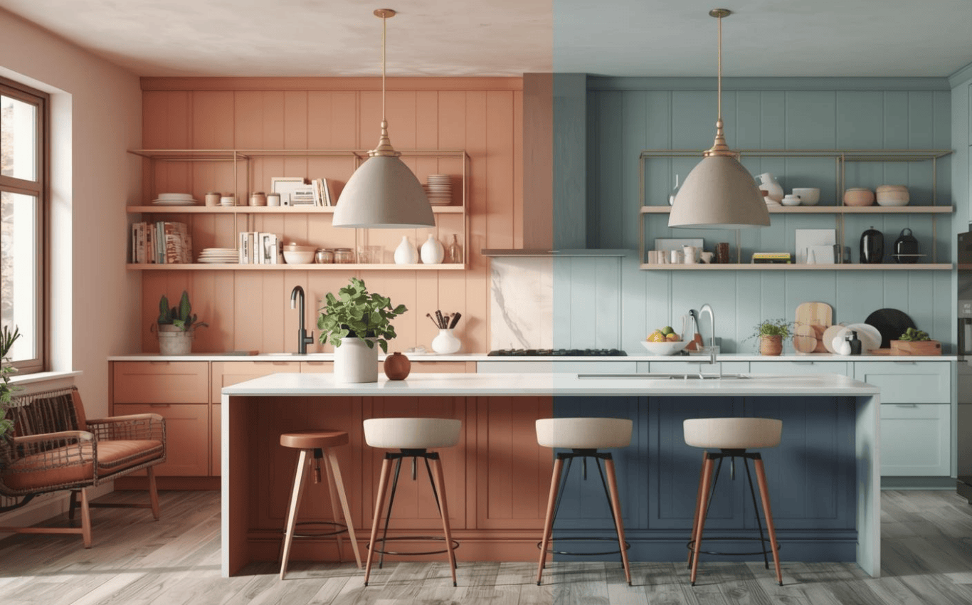
Before a cabinet is opened or a surface is touched, color sets the emotional tone of a kitchen. It influences first impressions, long-term comfort, and even how long people want to stay in the space.
This human-centered approach is a cornerstone of Jeff Boico’s Kitchen Design services, where color is treated as a functional decision-not decoration.
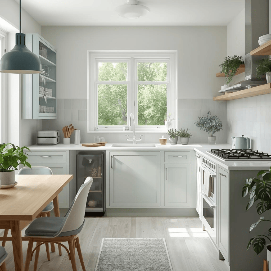
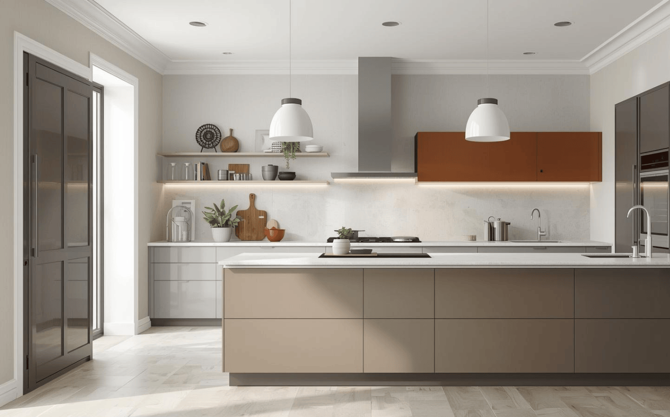
Warm colors such as soft whites, warm grays, taupes, and muted earth tones create an inviting atmosphere. They reduce visual sharpness and help kitchens feel more welcoming and less clinical.
In modern kitchens, these tones are often layered subtly rather than used boldly, allowing the space to feel comfortable without becoming heavy or dated.
Cool colors, such as crisp whites, cooler grays, and restrained blues bring a sense of order and cleanliness. When used intentionally, they enhance focus and precision, especially in high-functioning kitchens.
The key is balance. Too much cool tone can feel sterile, while the right mix supports clarity without sacrificing warmth.
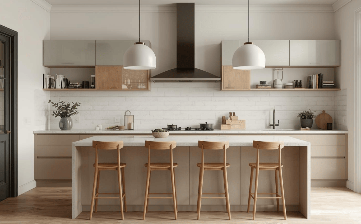
One of the biggest misconceptions in modern kitchen design is that neutral palettes lack personality. In reality, neutrals allow texture, light, and proportion to take the lead.
This concept is explored further in Why Spacious Kitchens Are the Heart of Modern Luxury Homes, where visual calm plays a major role in emotional comfort.
Color doesn’t just affect how a kitchen looks, it influences how it’s used. Strategic color placement can improve flow, reduce decision fatigue, and subtly guide behavior.
Lighter tones reflect more light, making kitchens feel larger and more open. This is especially important in modern layouts where the kitchen connects to adjacent living spaces.
In the Port Washington, NY project, light cabinetry and balanced contrast help the kitchen feel expansive and fluid, encouraging easy movement throughout the space.
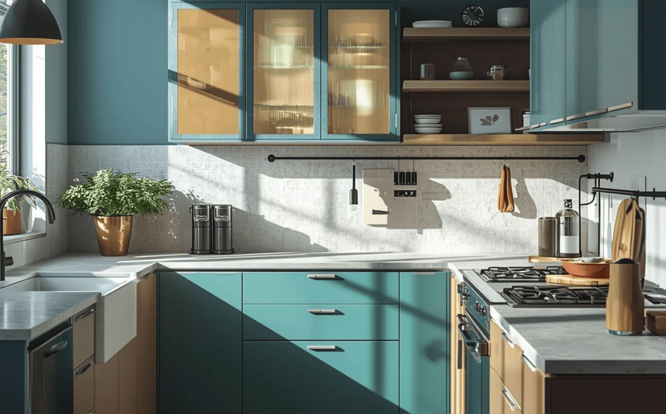
Modern kitchens often rely on color contrast instead of walls to define zones. A darker island base, a contrasting backsplash, or a shift in cabinetry tone can signal where specific activities happen.
This visual zoning improves usability without breaking openness an essential principle in contemporary design.
Too many competing colors force the brain to constantly process information. Modern kitchens benefit from restrained palettes that repeat intentionally across surfaces.
This idea connects closely with The Kitchen as a Control Room: How Design Reduces Daily Decision Fatigue, where visual simplicity supports mental clarity.
Color never exists alone. Its impact is shaped by lighting conditions and the materials it’s applied to. In modern kitchens, understanding this relationship is essential.
Morning light, afternoon sun, and evening illumination all affect how colors appear. A tone that feels warm at noon may feel flat or cool at night.
Modern kitchen design accounts for these shifts, ensuring that colors remain balanced and comfortable at all hours.
Lighting temperature dramatically affects color. Warm lighting enhances earthy tones and soft neutrals, while cooler lighting sharpens contrast and clarity.
Thoughtful lighting strategies explored in Elevating Your Kitchen with Lighting: A Guide to Ambient, Task, and Accent Options , ensure that color supports both mood and function.
Matte finishes soften color, while polished surfaces reflect it. Natural materials like wood and stone introduce subtle variation that keeps a palette from feeling flat.
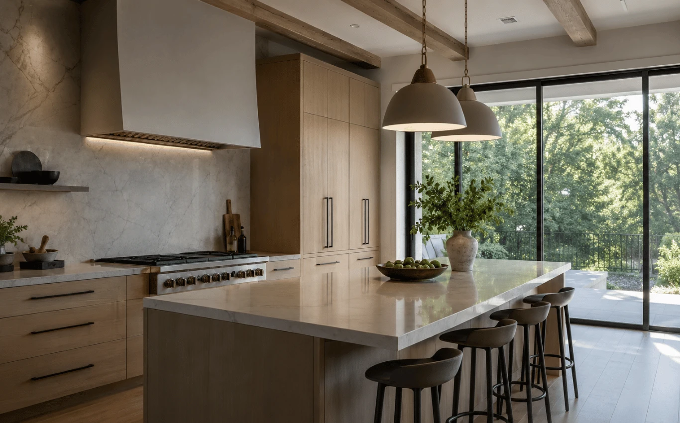
In the Roslyn Estates, NY project, material choice works hand-in-hand with color to create depth, balance, and long-term visual comfort.
Trends come and go, but color psychology endures. Timeless kitchens are built around palettes that feel grounded, adaptable, and emotionally stable.
Highly saturated or overly specific colors often feel dated quickly. Modern kitchens designed for longevity rely on adaptable base palettes that can evolve through accessories and accents.
This approach ensures the kitchen remains relevant without constant renovation.
Color is one of the most personal aspects of design. The challenge is expressing individuality without overwhelming the space.
By anchoring bold preferences with neutral foundations, modern kitchens achieve personality without chaos a principle echoed in The Power of Personalization in Kitchen Design: Customizing Your Space for Function and Style.
A well-designed kitchen supports multiple moods, quiet mornings, busy afternoons, and social evenings. Color transitions, layered lighting, and thoughtful contrast allow the space to adapt naturally.
This emotional flexibility is what separates truly modern kitchens from visually impressive but impractical ones.
In modern kitchen design, color is never just a backdrop. It shapes emotion, supports function, and influences how the space is experienced every day. When guided by color theory rather than trends, kitchens become calmer, more intuitive, and more enduring. The most successful modern kitchens don’t announce their design choices, They let you feel them. By understanding how color affects mood and behavior, designers can create kitchens that not only look beautiful, but genuinely improve the way people live.

Ready to use color intentionally to shape how your kitchen feels and functions?
Get In Touch